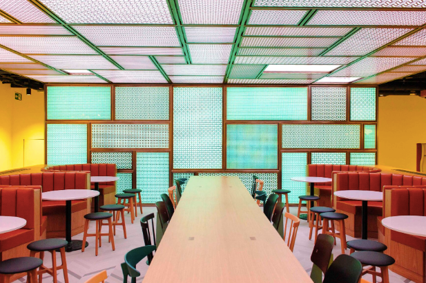
Colour plays a pivotal role in shaping how spaces feel and function, and Umbrella Furniture is leveraging colour psychology to create work environments that inspire productivity, collaboration, and well-being.
 © Estée Lauder
Each hue is selected with purpose. Blue, used in The Telegraph offices, evokes "calm, focus, trust," while red, featured at AO Hatten, conveys "energy, confidence, passion." Green, chosen for Schibsted, promotes "balance, wellness, renewal," and orange at Booking.com fosters "creativity, playfulness, warmth." For a timeless and professional aesthetic, Cleary Gottlieb Steen & Hamilton LLP opted for neutral tones, offering "versatile and enduring elegance."
By aligning colour choices with organisational goals, Umbrella Furniture ensures that design not only enhances the visual appeal of workspaces but also supports the emotional and psychological needs of those using them. This thoughtful integration of colour psychology demonstrates how interiors can be tailored to boost morale, encourage collaboration, and reinforce brand identity.
Through innovative design and a nuanced understanding of colour, Umbrella Furniture continues to craft environments that go beyond aesthetics, creating spaces that actively support productivity and well-being.
Source: LinkedIn.