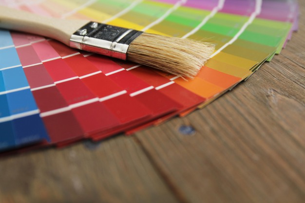
Interior designers reveal the least suitable colour for a bedroom, citing its stimulating and disruptive qualities. Toronto designer Jessica Cinnamon explains that this colour is "highly stimulating and associated with energy and alertness," making it unsuitable for a space intended for rest. Dallas designer Lauren Saab describes the colour red as an "assertive colour" that overwhelms, while California-based designer Marcia Bryan warns that red can "disrupt your sleep patterns" by increasing heart rate and blood pressure.
 © Isabel Poulin | Dreamstime
While muted tones such as burgundy may feel cosier, experts maintain that red "always wants to speak louder," making it difficult to create a calm environment. Instead, designers recommend using red sparingly through accents like cushions, artwork, or bedding to add subtle drama without compromising serenity.
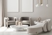
For more restful alternatives, terracotta offers warmth and timelessness, while "grounded neutrals" like mushroom, soft caramel, and warm stone create a soothing, understated atmosphere.
Although red is ill-suited for bedrooms, it can thrive in other spaces. Designers suggest using it in dining rooms to stimulate appetite or in powder rooms for a bold, jewel-box effect. In these areas, red can transform a space, but in the bedroom, serenity should always take precedence.
Source: www.apartmenttherapy.com